As a disability services provider and advocate for all learners with different learning needs, I am always interested to see reports in the media concerning accessibility services. I was eager to learn of the newly created font to help readers with dyslexia. I not only appreciate the creation of the font, but I also appreciate the awareness that the media has brought to the idea of dyslexia and other learning disabilities.
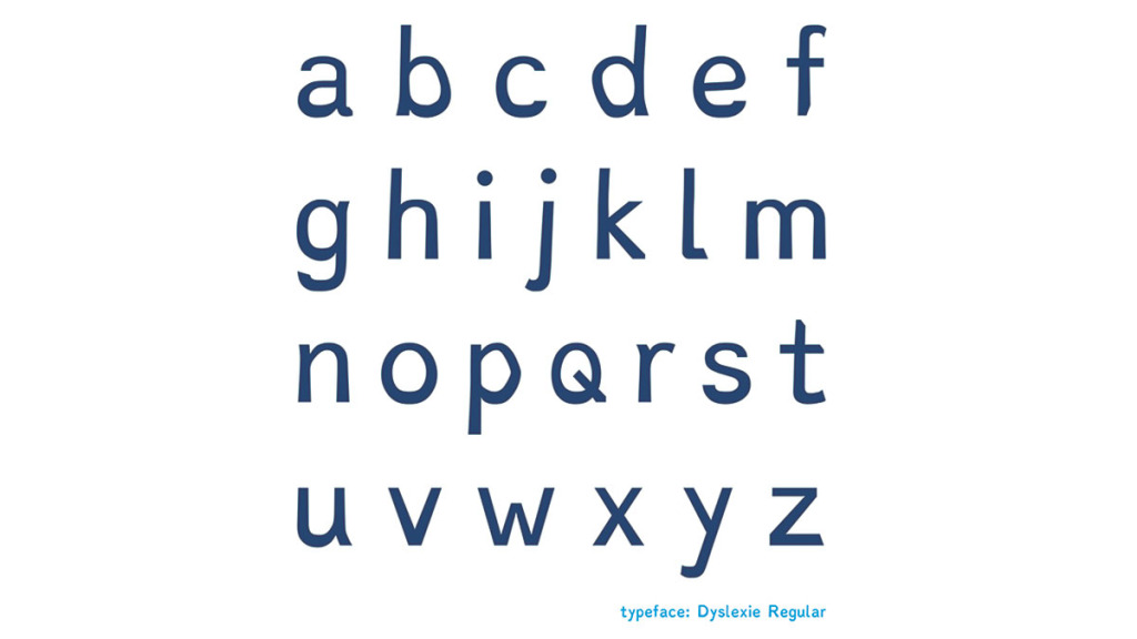
Christian Boer, the creator of the font “Dyslexie,” has dyslexia. According to the reports I have read in the Boston Globe, The New York Times, Entrepreneur.com, USA Today and NPR, the font is designed to help alleviate some of the difficulty that individuals with dyslexia may face while reading. The font is formatted to make a distinct difference in the letters. Boer placed a heavier emphasis on the bottom of each letter and used slight italics to differentiate letters that many traditional fonts do not. For example, in traditional typeface, the letters b, d, p and q are all the same version of the letter just flipped and or rotated. By creating the heavier bottom, it may help some readers anchor each letter to the page. Many of the articles explain the intentional nature of the font and how each character is uniquely distinguished to help it stand alone and be easier to identify and not confused with a similar character.
Finding strategies, tools and techniques that work for people with a disability is as unique as each individual with a disability. This font will likely be appealing to many individuals with or without dyslexia. It moves us toward a more universal approach to designing and implementing tools that appeal and work for the masses. All learners have different preferences for what appeals to them and what works for them, so having another option that will enhance or aid in one’s ability to read is certainly positive. The fact that the font can be downloaded for free creates even greater access to those interested in trying the font with no financial implication if the font does not work for them. According to the font’s website, dyslexiefont.com, there is a difference between home use versus educational and business use, so reading terms, agreements and license conditions are always important in determining appropriate usage. Educators and businesses may choose to purchase a license for the font to use it when creating PowerPoints and other print materials to help enhance the experience and access to a variety of learners.
The creation of this font encourages all of us to be more intentional about how we can present information in more accessible formats. From an education and advocacy standpoint, any time we can understand an individual’s barriers to learning or ways to include all learners in the process and experience of learning, we are making steps in the right direction. Any student having difficulty reading or learning, who has or suspects they may have a learning disability is encouraged to meet with our office. Student Accessibility Services is located in Towers Concourse 110 and can be reached by calling 607-274-1005.
Leslie Kelly is the manager of Student Accessibility Services. Email her at [email protected].