Sakai is a tool that all Ithaca College students use, but one student has developed an extension to make it “better.”
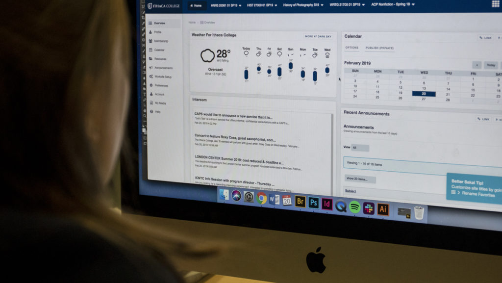
Senior Barrett Smith created Better Sakai, a Google Chrome add-on that redesigns the presentation of Sakai to make it more user-friendly. He said he created the extension in January 2019 as an experiment for himself because he did not like the design of Sakai. Sakai is one of various learning management systems colleges and universities use to organize class assignment information.
Smith works in the Department of Information Technology at the college and helps train faculty members on how to use Sakai. Smith has a background in website development but no prior experience in making extensions. Smith said he is mostly self-taught and started coding with CSS — or CSS — which is a programming language. In the past few years, he has taught himself HTML, Hypertext Markup Language and JavaScript.
Smith said that he started developing a CSS style sheet for Better Sakai last year but that he reached out only a few weeks ago to the creator of Less Terrible HomerConnect — a Google Chrome extension that changes the design of HomerConnect — to get tips on how to create Better Sakai. He said it only took him a few days to then package his extension and submit the first version of Better Sakai to the Chrome Web Store.
Smith said that although Sakai offers many features, the site lacks a user-friendly design and is difficult to navigate. However, because there are so many customizable features on Sakai, Smith said, this leads to inconsistencies for users. For example, when navigating in Sakai, clicking on some tabs will change the window content without opening a new tab, and clicking on others will take users to an entirely different page. He said this creates a confusing experience for users. This is where his styling comes in.
“I kind of feel like my extension takes the features of Sakai and wraps it in something that looks a lot cleaner and nicer,” Smith said.
Smith said he redesigned the website to make buttons clearer and more consistent. He also made different parts of the website clearer to distinguish from each other. Smith added a feature that saves users’ scroll positions so that when a page reloads, it does not bounce back to the top.
David Weil, associate vice president of the Department of Information Technology, commended Smith for his work on the extension.
“It’s always great, I think, when students experiment and try to do something that takes a service or takes something and tries to make it better,” Weil said.
Weil said that although he commends Smith’s work, the college has not reviewed the extension. He said that because it was created by a student and the college has not reviewed it, it may not be fully functional.
Senior Stetson Doggett downloaded Better Sakai and said the extension presented the site in a visually aesthetic, appealing and understandable way. He said this presentation helps users to focus on tasks and presents information in a more digestible way.
“I think it just improves the overall experience of using Sakai, which I know is something a lot of students are on a lot,” Doggett said.
Smith added a few functional features as well, like a button in the grade book section that takes users right to the Satisfactory, D or Fail form if they want to take a class pass-fail. Smith said he is currently working on a feature that allows users to choose their own accent color.
Freshman Adam Kluge is a user of Better Sakai and said he thought the design was cleaner. He said he found it to be a more productive and accessible way to keep tabs on his own academic performance.
“It’s much nicer, aesthetically,” Kluge said. “Basically, at the end of the day, it’s just a … better Sakai.”
Freshman Kaitlyn Calhoun said she liked Better Sakai’s layout because it is more organized.
“The font is nicer,” Calhoun said. “It’s more pleasing to the eye. There’s a search button, which is pretty nice. I think that I’ll definitely use this in the future.”
Freshman Cat Fox said she liked that she is able to see the weather on the homepage of the site with the extension.
“As a student, it’s nice to have everything in one place,” Fox said.
Smith said the HomerConnect extension inspired him to share his redesign of Sakai with the rest of the campus community. Both Better Sakai and Less Terrible HomerConnect are free to download on Google Chrome.
Smith said he chose to make the extension free because he does not think students are passionate enough about Sakai to invest money into a better version of it.
“I created Better Sakai to challenge myself, improve my skills and learn,” he said, “The knowledge and skills I have gained in the process of developing Better Sakai are the return on the time I invested.”


